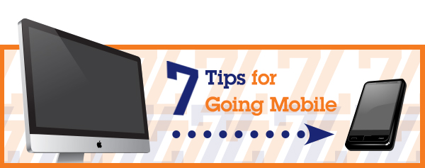
We’ve talked about how important mobile sites are and why responsive design is a great option. To help you get started, we’d like to share some tips on creating a good mobile web site. Ready to take the plunge? Keep these guidelines in mind:
1. Avoid too much copy.
Smaller screen sizes leave no room for fluff. Prioritize content, put the most important information first (like your mission) and cut the unnecessary stuff. Plus, online visitors don’t read, they skim. Consider using subheads, bullets and lists. Pull out your red editing pen and slash away!
2. Minimize your site’s load time.
Make sure your site loads in under five seconds and remove anything that makes it stall. There are several online tools you can use to check your site for performance problems; try Pagespeed from Google. If you’re using several photos, make sure they’re organized well and look clear enough on the small screen. Bottom line: make it fast and your site visitors will thank you for it!
3. Keep your design clean and simple.
Like too much text or too many photos, a cluttered design is a turnoff on the small screen. Keep it simple, keep relevant information up top and in the center so people don’t have to search, and narrow the focus to just one or two calls to action.
4. Don’t use technology that doesn’t work on many mobile devices.
These include anything developed in Flash and animations. Leaving those elements out will give you better results.
5. Don’t make your donor input form too complicated.
Ask for only absolutely necessary information, not simply nice-to-have information. Minimize data entry and use dropdown menus and checkboxes where possible. Typing on a smartphone is a pain even for the most accomplished whiz kid.
6. Make your buttons big enough for adult fingers.
Make sure real people can click on your buttons without having to zoom, and provide lots of white space around clickable items. Apple’s recommended fingertip size is 44x44px. You especially want to make sure your donate button is big, bold and noticeable.
7. Make sure you share.
Mobile users are especially active in social media and connecting via other platforms like Facebook and LinkedIn. Don’t forget to include links to your social media pages.

Leave a Reply